
Mobile SEO: An Optimisation Guide

Mobile optimisation ensures that mobile visitors to your website have an experience optimised for their device. Here we’ll explore why that’s so important in 2021.
Table of Contents
Introduction
As of 2020 the number of people using the internet on a mobile device was around 4.28 billion. That’s a hell of a lot of people accessing websites on anything from a mobile phone to a tablet.
Mobile web browsing and searching allows people to access your website on-the-go and enables them to make search queries and find answers to their questions instantly. Gone are the days of having to remember to look something up when you get home, with a smartphone in your pocket you’ll have an answer in seconds.
If people are using a mobile device to access your website then it needs to be mobile-friendly and optimised to meet the needs of mobile searchers that may be different to those using a desktop.
What is a Mobile Friendly Website?
A mobile-friendly website is effectively one that works just as well on a mobile device as it does on a desktop.
The key to choosing a design that works for both desktop and mobile is ensuring it’s responsive. This means that your website will adjust to fit the screen a user is accessing it on, rather than simply trying to display the desktop version on a small, mobile screen.
Could you imagine how much information would be squished onto the screen if you tried to access a landscape, desktop design on a portrait, mobile device?!
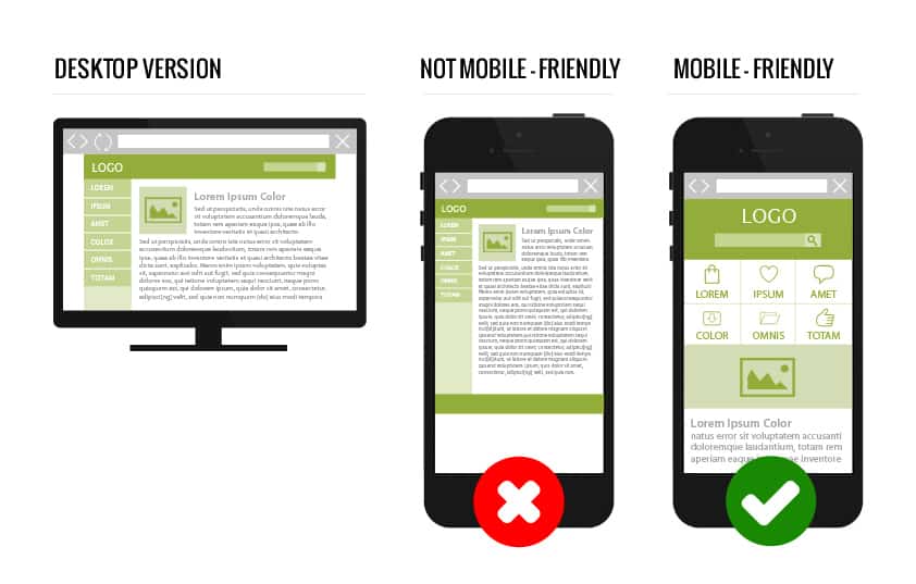
A mobile-friendly website should be easy to navigate and feature a font and colour scheme that are easy to read on a mobile screen. It’s always a good idea to limit pop-ups on the mobile version of your website as these will often fill the whole page and make it considerably harder for a user to navigate.
The key to creating a responsive, mobile-friendly website is to focus on improving the user experience. Think about how a user will navigate through your mobile website and flag up any potential problems.
Google’s View on Mobile Websites
Google classes having a mobile-optimised website as a top priority. In fact, back in 2019 the search giants announced they would be moving to “mobile-first” indexing.
What this means is that Google’s bots will crawl and index the mobile version of your website. So it’s pretty easy to see that the mobile version of your website needs to be up to scratch if you want to stand any chance of appearing in Google’s search results.
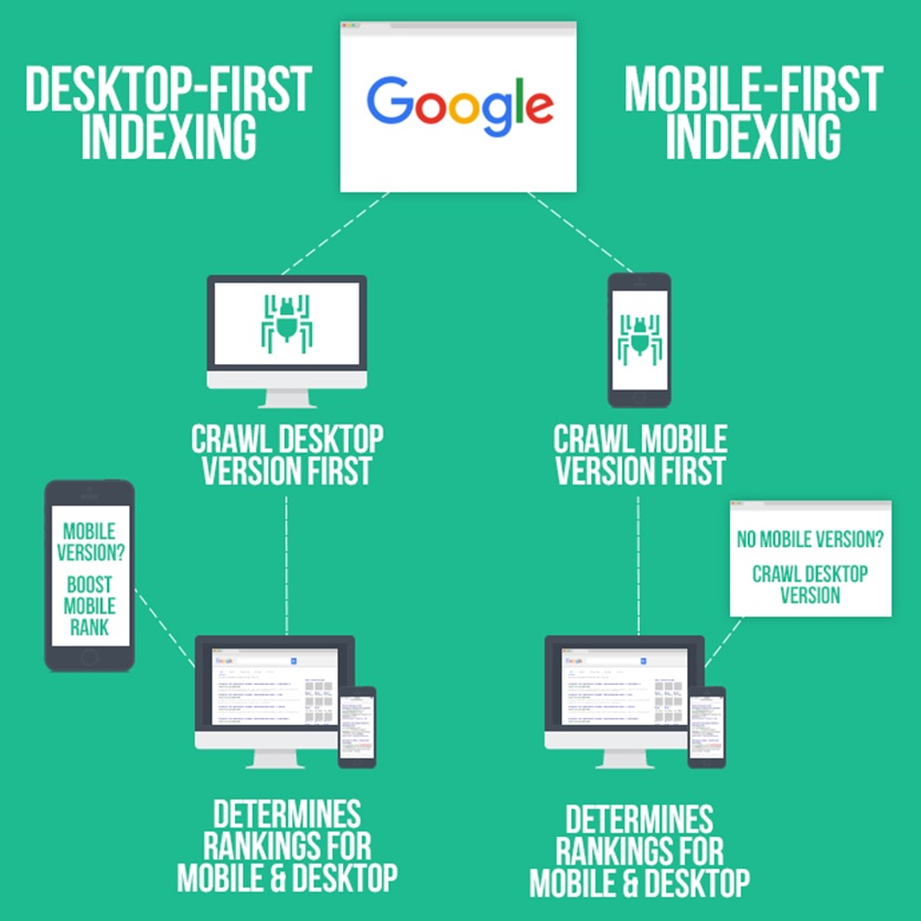
This also means that you can no longer present less information on the mobile version of your website. Back when mobile websites first became a thing, webmasters and designers would often choose to present a simplified version of their website and its content to mobile users. With Google placing such importance on the mobile version of your website however that’s no longer an option.
Many of Google’s key algorithm updates have included some focus on mobile optimisation including mobile page-speed, penalising websites that used aggressive pop-ups that impacted the mobile experience and mobile usability.
Having a mobile-friendly website that works on a mobile device is crucial and is one of Google’s core ranking factors but you need to make sure your website is fully optimised for mobile SEO too.
The Difference Between Mobile SEO and Desktop SEO
Whilst there are some key differences between optimising for mobile SEO and desktop SEO the key goals are often the same. You’re aiming to rank well for your target keywords and reach the right audience, increasing visitor numbers and conversions.
The main major themes of desktop SEO such as focusing on quality content, creating a great user experience and ensuring your website is running at peak performance can all be transferred to mobile SEO too. These are the core of SEO whether you’re optimising for desktop or mobile search.
Whilst with desktop SEO you’re normally aiming to reach a wide audience, often with mobile SEO you’ll be targeting a much more localised demographic.
The results you get when you make a mobile search can differ to what you would receive if you made the same search on a desktop too. Google tends to prioritise local listings and featured snippets for mobile searchers so it’s important to remember that just because you rank for a keyword on desktop doesn’t mean you’ll automatically have the top spot for mobile searches too.
How to Optimise Your Website for Mobile SEO?
There are various things you can do to ensure your website is fully optimised for mobile SEO.
Implement a Responsive Design
We’ve already covered the importance of having a responsive design but it really is the very first thing you need to do in order to ensure your website is fully optimised for mobile SEO.
Make sure that your website adapts for any device someone may use to access your website. Without a responsive design you risk driving people away, adding to your bounce rate and lowering your chance of both conversions and climbing Google’s rankings.
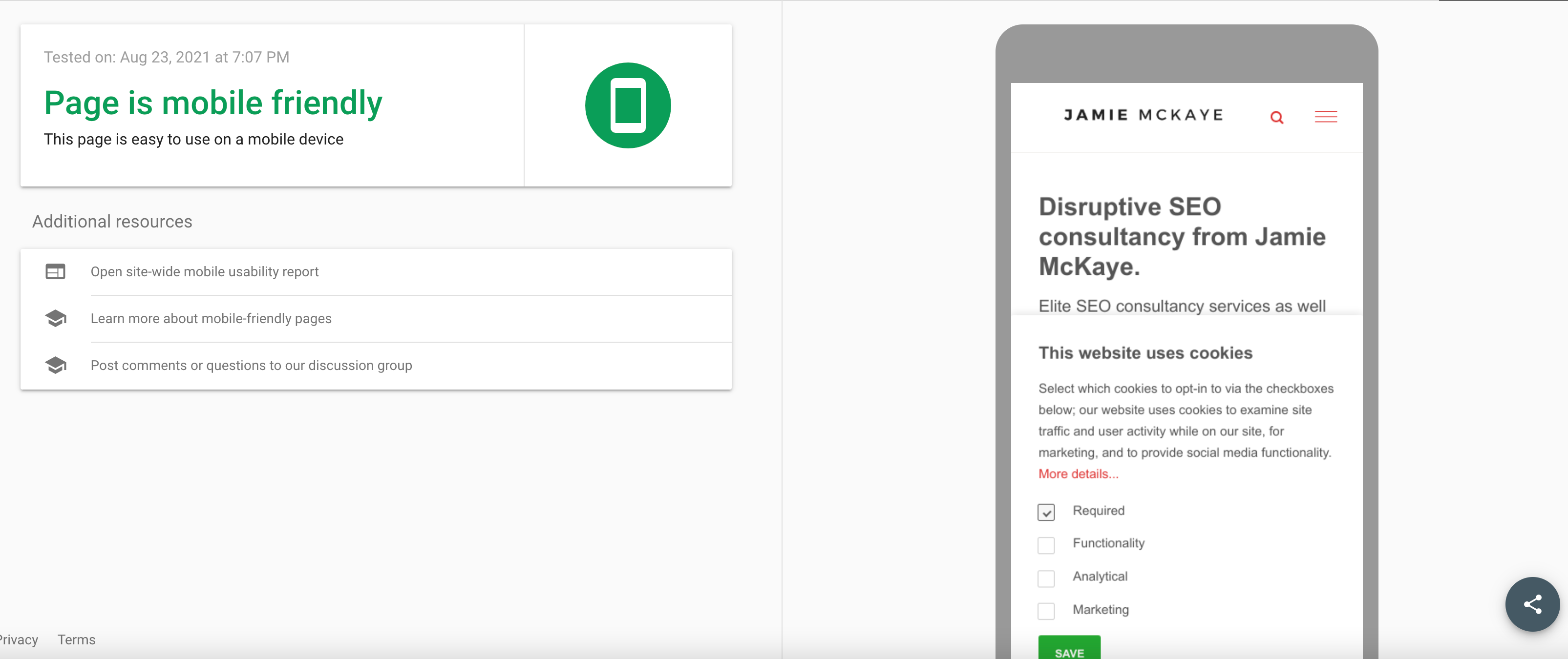
You can check your mobile-friendliness with Google's tool
Improve Page Load Speed
How quickly your website loads has a major impact on how well it’s optimised for SEO. If a user is searching on a mobile device Google will often presume that they want an answer quickly.
They may be on-the-go or looking for instant results. Therefore you need to ensure that your website can meet their needs by loading as fast as possible. If your website takes too long to load users will simply bounce back to the SERPs and select another result instead.
One of the best ways to check the load speed of your website is by using Google’s Page Speed Insights tool which will highlight where your website is performing well and where it may need some work to help speed it up.
Here's mine (gulp)
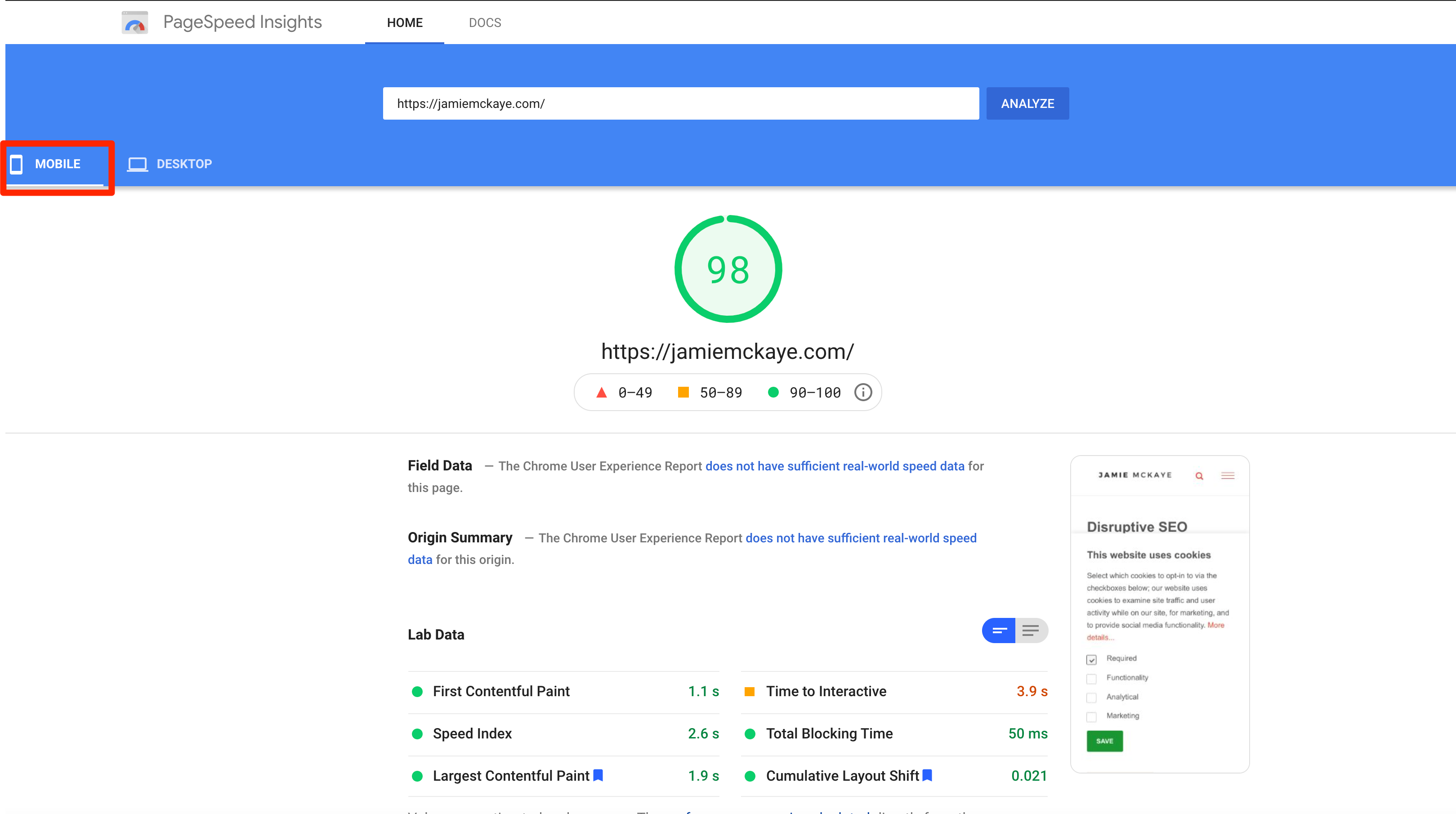
Phew, I have worked on it!
There are various things that can impact your page load speed including:
- The number of redirects you have running on your website. Try to keep these to a minimum.
- Your images. Optimise your image to ensure they aren’t too big or contain too much data, both of which can slow down your website.
- The quality of your web hosting provider.
Focus on User Experience (UX)
Whilst having a responsive design will go a long way to improving the user experience of mobile visitors to your website there are more things you can do to ensure it’s top notch.
Google prioritises user experience. If your website is low-quality or users have a hard time finding the content they’re looking for then Google won’t rank you highly in their search results. The search engine wants to ensure only the very best content appears on page one.

So what can you do to help improve the user experience of your mobile website?
- Ensure the font is legible on smaller screens. Make sure everybody can easily read all of your content.
- Use CTA (Call to Action) buttons that are easy to spot and click on. Whether it’s a phone number, email address or downloadable PDF, make sure mobile users can spot and engage with them straight away.
- Make sure it’s “thumb friendly”. Most people use their thumbs to scroll so avoid too many extra buttons and pop-ups that users may accidentally click on when scrolling through your website. If it’s too fiddly to use on a mobile device users will quickly grow frustrated and look elsewhere for the content they are searching for.
Ensure Easy Navigation
The navigation of your website plays a massive part in how easy it is for users to access the information they’re looking for. In order to ensure you’re optimising your website for mobile SEO you need to ensure you have a mobile-friendly navigation system in place.

The most common and easy-to-use mobile navigation option is a hamburger menu. A hamburger menu sits at the top of the page and is made up of three lines (just like a hamburger...get it?!). When a user clicks on the hamburger a drop-down menu will appear, featuring all of the different pages within your website that they can navigate to.
A hamburger menu keeps your mobile web pages looking clean and ensures users can move around your website with ease.
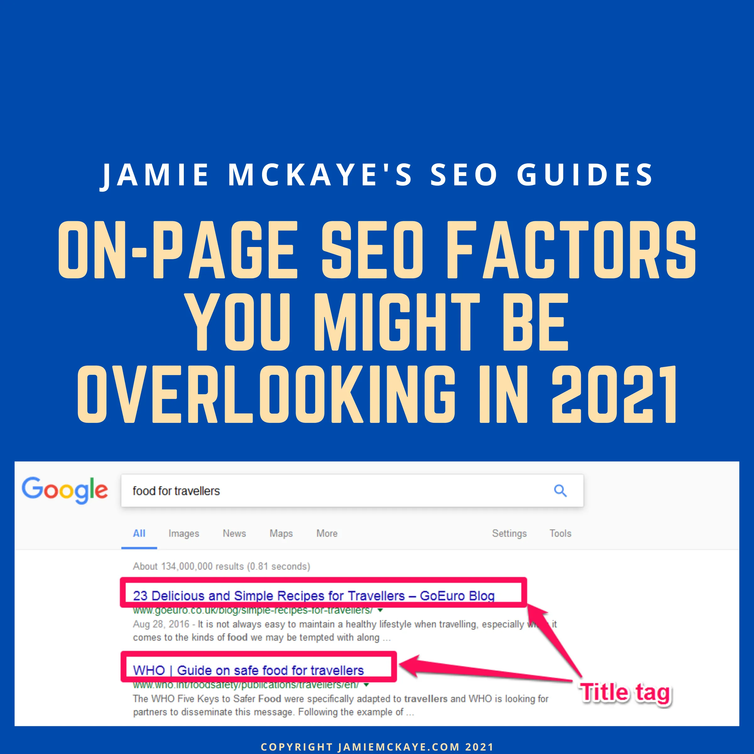
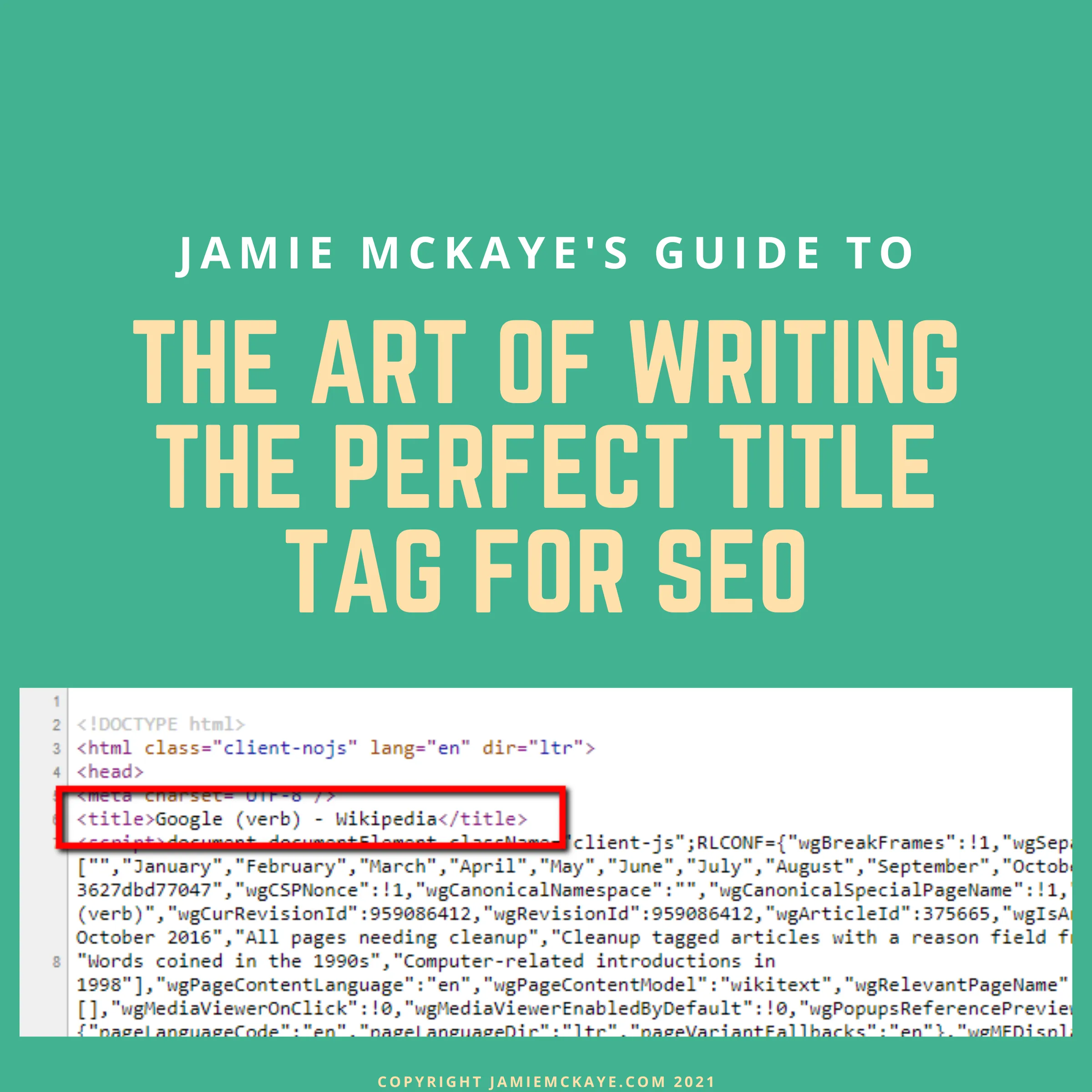
Optimise Title Tags and Meta Descriptions
Your title tags and meta descriptions play one of the biggest roles in encouraging users to click through to your website.
Title tags and meta descriptions are the content that actually appears in SERPs and is what a user sees when they are presented with listings following their search query. The title tag is the main headline of the listing whilst the meta description is the brief paragraph that appears below the title.

Your title tags and meta descriptions therefore need to be fully optimised for SEO and be good enough to attract the attention of the user.
There are various things you can do to ensure you write the perfect title tag and meta description for mobile SEO including:
- Put your keywords at the start. Google limits the characters for both title tags and meta descriptions so make sure the keywords your targeting feature near the beginning.
- Keep it short and sweet. Remember you’re working with less screen space on mobile so make sure you keep both title tags and meta descriptions short, whilst still including all of the relevant information.
- Mobile users are often looking for information fast so make sure both your title tag and meta description is a clear and concise description of the content on your page.
Target Local SEO
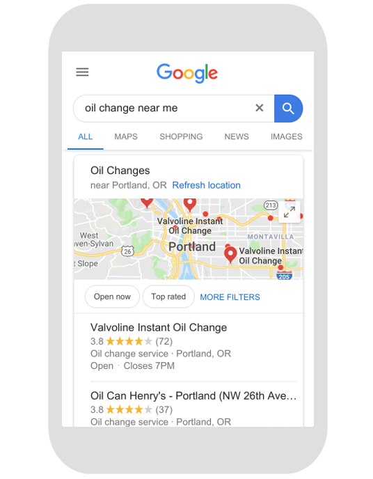
Did you know that mobile searches featuring the phrase “near me” occur three times more than any other search query? Targeting local SEO therefore is a major part of mobile optimisation.
If you’re looking for a local result and making a search using phrases such as “near me”, “open now” or “closest to me” then there’s a good chance you’ll be searching using a mobile. Google presumes that if a user is looking for a hyper-local result then they are probably out and about using a mobile device and not sitting at home on a desktop.
Here's an example:
You therefore need to adapt your mobile SEO strategy in order to target these searches. A great way of optimising for local SEO is to start targeting local search terms such as “camping equipment Cheshire” that way if somebody is searching for a camping equipment shop in Cheshire you’ll stand a good chance of appearing in results.
Create a Separate Mobile URL
An option that is worth considering when optimising your website for mobile SEO is creating a parallel website for mobile users. Doing so allows you to create completely custom and unique content and experiences for mobile visitors.
Using a simple “m” subdomain helps to avoid URL confusion and you should ensure it’s easy for visitors who end up on the wrong version of your website to switch over to their preferred experience.
Have you ever landed on a website on a mobile device and been prompted to “switch over to our mobile website” or asked to select if you’re browsing via mobile or desktop? This is an example of a parallel mobile website in use.
Key Takeaways
We all know the importance of targeting mobile users by now. With everyone seemingly having a smartphone glued to their hands at all times, websites need to adapt to ensure they’re offering the very best experience no matter how a user is accessing their content.
When getting to grips with the importance of having a mobile-friendly website and optimising for mobile SEO it’s important to remember:
- Google has transitioned to “mobile first” indexing meaning it’s the mobile version of your website that its bots will be crawling.
- A responsive website means a user has the same user experience on the mobile version of your website as they would on a desktop.
- Improving the load speed of your website is crucial if you want to target “on-the-go” mobile searches.
- Mobile SEO and local SEO go hand-in-hand so try to target localised keywords.
- Make sure your title tags and meta descriptions are optimised to give users the key information about the content on your web page.
Mobile searching isn’t going anywhere in fact it’s only set to become a more popular way of browsing the web therefore, if your website isn’t already optimised for mobile then you need to send it straight to the top of your to-do list.
Comments